Adding a Scale Break to Your Graph in Stata
For various reasons Stata does not allow for the creation of scale breaks when creating graphs. However, there are several methods you can use to edit your graph so that it contains scale breaks. The easiest way to do this is to label a tick mark on the graph differently than its actual inherent value.
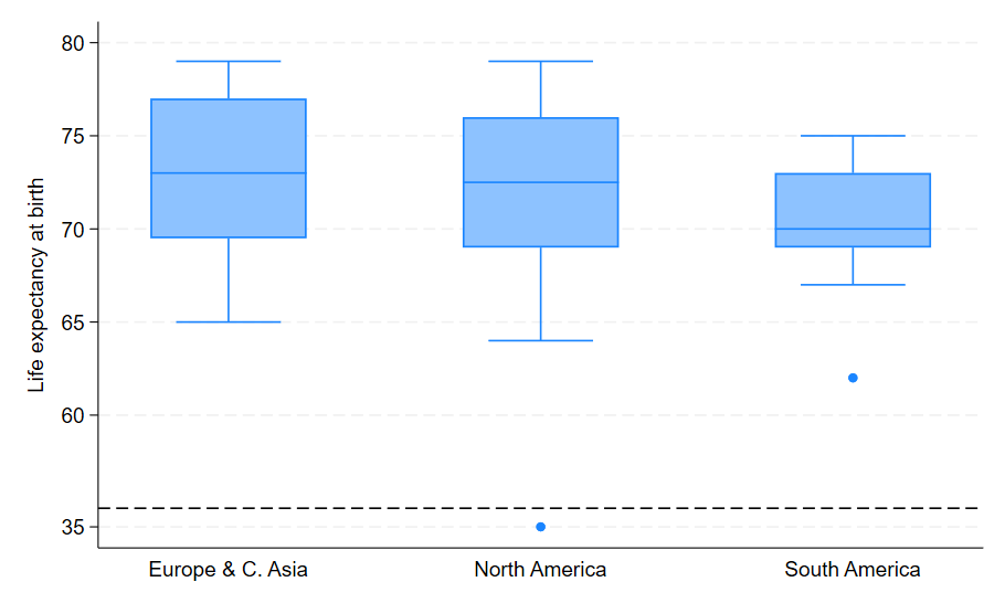
For example, we load a dataset on life expectancy across many countries. Let’s say we notice that the life expectancy for Haiti is wrong. The dataset shows this as 54, but we know that the actual life expectancy for Haiti in this data is supposed to be 35. As this is much lower than the average across the other countries in the region, this means when we graph we will get a distorted graph because of this outlier. However, instead of changing the underlying value of 54 in the dataset, instead we are going to change the label attached to the value, so it shows as 35. We can also add an extra line at a slightly higher value to show there is a scale break here.

To generate this graph in Stata, use the following commands:
sysuse lifeexp, clear
graph box lexp, over(region) ylabel(54 60(5)80) yline(55)
gr\_edit .scaleaxis.edit\_tick 1 54 `"35"', tickset(major)
Some graphs will allow you to make this change using the valuelabels part of the ylabel option. For example ylabel(54 60(6)80, valuelabels). This is not possible for the box plot, however we can use the graph editor to make the change instead. All changes in the graph editor, if saved in a .gph file or recorded with a .grec file, can be used as regular edit commands if you add the gr_edit command to the beginning, which is what we have done here.