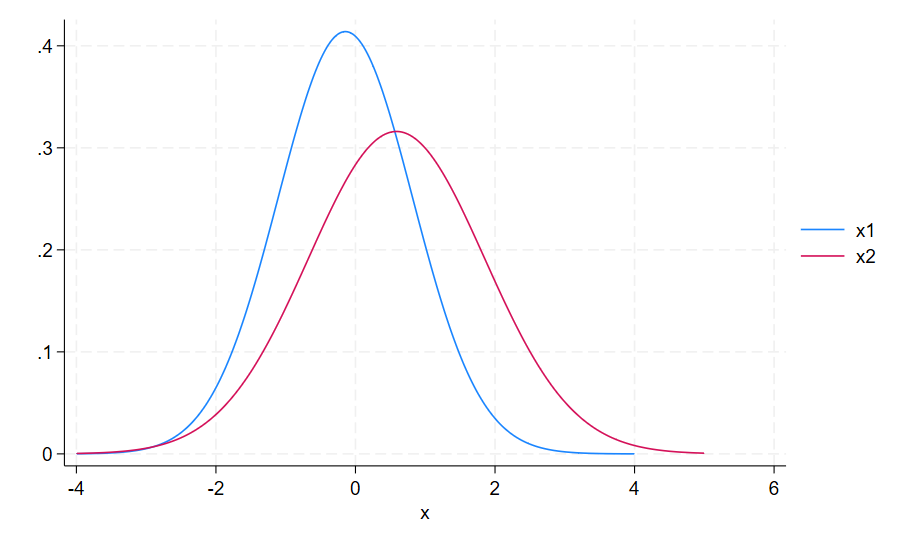
Comparing Bell Curves
The bell curve can be used to express a mean and standard deviation over a large data set. This particular graph compares separate bell curves within the same graph, making it easy to compare and contrast the two data sets.

The following code can be used to create the ‘Comparing bell curves graph’
clear
set obs 100
generate x1 = rnormal(0,1)
generate x2 = rnormal(0.5,1.3)
summarize x1
local M1 = r(mean)
local SD1 = r(sd)
summarize x2
local M2 = r(mean)
local SD2 = r(sd)
twoway function x1 = normalden(x, `M1', `SD1') , range(-4 4) || function x2 = normalden(x, `M2', `SD2'), range(-4 5)